Ikea Abstract Kitchen (white high gloss)

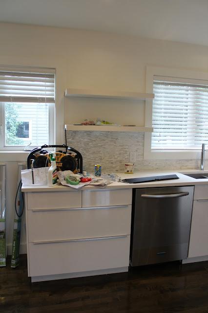
Hello.  Thought I would share a few photos of our finished Ikea Abstract white high gloss kitchen from the last renovation my client did.  I had posted some during the renovation process but those are always such a mess with tools...and um...a few beer and wine bottles...and maybe some restaurant take out.  None of it's mine though...honest;)

Ikea abstract white high gloss kitchen.  Benjamin moore cloud white

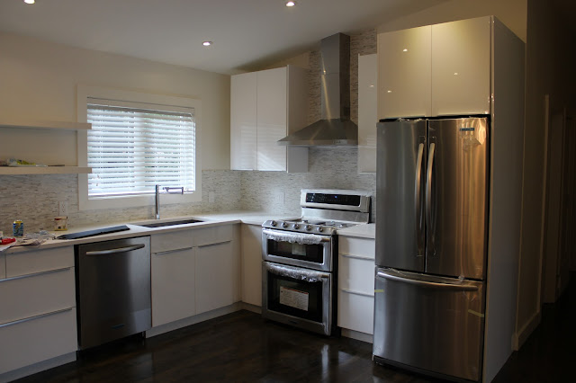
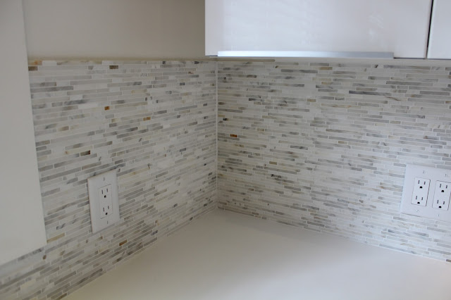
We obviously used Ikea abstract white high gloss cabinets.  The uppers were the extra tall cabinets.  Counters are white quartz.  Back splash is calacatta marble bullets from Saltillo Tile.  Wall paint is Benjamin Moore Cloud white.  The faucet is Uberhaus brand from Rona.  Appliances are Kitchen Aid.  (I'm loving these double oven ranges.  I think they are perfect for places where there are space or budget restrictions).  The floating shelves are from Home Depot.  The hardware is from Ikea and are the Blankett handles. 

ikea abstract white high gloss kitchen.  Benjamin moore cloud white

Speaking of hardware...here are a few tidbits I learned during this renovation and kitchen planning process. First, you can see in some of these pictures there is a small 12" base cabinet on the left side of the stove.  It is a basic cabinet with a door.  I had no choice but to use it there as a corner cabinet would not fit and there were no 12" base cabinets with drawers.  So FYI for anyone looking to use Blankett handles, they don't make a 12" handle to fit these cabinets so we ended up having to use one of the really small handles (I believe they are about 1.5 to 2") and they look like the Blankett handles or were made to compliment them (sorry I can't find these particular ones on the Ikea website right now so I don't know the exact name).  I do like these smaller handles and it is pretty discreet being at the very top of the door and right under the counter so it's not that noticeable, but it would have been nicer to have all the same handles especially since we also used the longer ones on the upper cabinets as well. 

ikea abstract white high gloss kitchen.  Benjamin moore cloud white

Now, on that note...I wish I had of used the smaller handles on the upper cabinets.  I don't mind the longer ones but I can see now how the shorter ones would have maybe been a little cleaner or sleeker looking and also added some interest with the change in hardware.  That's one thing I'm still learning: different is good, contrast is my friend.  Aesthetically speaking they would have been nicer but I also learned the hard way that they would have functioned better too since you need to be careful with what is beside each door and how it will open and whether the handle will hit anything.  I've always taken this into consideration with lower cabinets especially near corners and on drawers but I realized after installing the handle on the upper cabinet in between the fridge and stove, that whenever we open the door, the end of the handle (closest to the corner by the fridge) ended up scratching the fridge panel when opened all the way.  It wasn't a big deal since the cabinet door could still be opened wide enough without scratching it but a smaller handle would have been much better.  

ikea abstract white high gloss kitchen.  Benjamin moore cloud white

Aside from a few screw ups learning lessons I am still happy with the way things turned out and I still love the high end design you get from Ikea kitchens for the price.   I am currently planning a two-toned kitchen for another house using these same cabinets for the uppers and the Gnosjo cabinets for the lowers so be sure to check back in the next little while to see our progress.  We are also installing Marmara tile on a large scale fireplace....my boldest Kelly Wearstler move yet!  I'm so excited...and a little scared.  Okay a lot scared!  This is why there is wine onsite.  Until then, have a great weekend!

new year, new look!

Ruffle Tower Cake
marthstewart
   Yes I have fallen hard for pink and gold as you can tell from the new blog design.  Or maybe the blog design is blush and camel...whatever you want to call this trendy little colour scheme (in all it's variations) it definitely has me head-over-heels and hot on the bargain hunting trail for anything reeking of 1970s and Hollywood glam.  Hopefully you'll check back soon as I am also working hard on an office makeover for myself that may or may not involve some pink and gold, as well as another Ikea kitchen (my first two toned kitchen design), and a fireplace covered in gorgeous marmara tile.  As I look forward to sharing my attempts to decorate while in my pink and gold drunken stupor, I hope your future plans are as bright and sparkly and make you giddy with excitement! 

budget bathroom makeover

Hello!  Thought I would share a few photos of a budget bathroom makeover that I did.  The house was being sold so unfortunately I couldn't inject my alter-ego Kelly Wearstler design style into it.  I know my design projects aren't exactly swanky yet but I like to share my experiences with trying to create a semi-decent design with limited funds (aka: the budget for the house was already blown at this point), limited sources (aka: in-stock hardware store options only), and limited Hollywood glam (aka: NO Kelly Wearstler inspired ideas).  I like to share stories from my stress-filled fun filled days of pretending to be a designer because I know how much said stories from others have helped me. 


Before:


After:


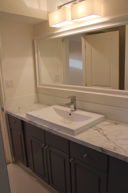
This bathroom was in a basement and had a really awkward layout making it long and skinny.  Since it wasn't in the budget to change any of that I had to work with trying to brighten it up and make it look a little less awkward.  We opted for basic white subway tile around the tub and an inexpensive white tile for the floor.  Yes, the floor tile is white.  I know it looks very warm in these photos but it was white.  And yes I am registered to take a photoshop class very soon.  We kept the vanity and painted it BM Whale Grey and added some new knobs from Ikea.  The counter top is Belanger laminate Calacatta Marble and was purchased from Rona (Canada).  I saw this same counter used on Income Property and thought it looked great paired with some higher end finishes (it's all about the high/low with budget decorating isn't it).  There is a really good pinterest board with all the episodes where they used these laminates where I found inspiration  http://www.pinterest.com/formicagroup/formica-laminate-on-hgtvs-income-property/  This counter was actually a kitchen counter but we cut the back off to fit the vanity.  Cutting the back off of these ready-made counters is something I always do anyway even in kitchens.  I don't like the little back splash pieces of formica that come attached to the counters so we cut them off and tile all the way down to the top of the counter.

Benjamin moore whale gray grey marble budget bath milk glass tile

The sink is probably my favourite item.  I love the clean, modern lines around the edges and how low it sits on the counter.  So many of these in-stock, top-mount bathroom sinks sit a lot taller on the counters and usually have rounded edges or a round look to them so I was really happy to find this more modern one at Rona (love their Uber Haus product line).  I only wish it had a 3 hole faucet option as I think it would have looked better with a different faucet.  The backsplash tile is milk glass from Saltillo tile.  Okay, okay, I know milk glass isn't exactly budget friendly but I liked it the best and it is all about the high/low right...right?  I'm sure white subway tile would have been fine too...maybe.  The white framed mirror is from Rona but I know Ikea also carries a very similar mirror.  A big mirror was definitely a necessity to help enlarge the space.  

Benjamin moore whale gray grey marble budget bath milk glass tile

Now...about the wall colour and light fixture...the walls were painted BM white whisp but for some reason this bathroom was painted a second time by a painter who mixed the remaining small amount of white whisp with some cloud white and this was the end result.  I'm not sure why this happened but unfortunately it did.  The straight-up white whisp looked so much nicer and was perfect with the whale grey!  The light fixture was also kind of a mistake.  It was originally purchased for somewhere else but when it didn't work out and we could no longer return it, it ended up here.  I do like the light very much and think it looks okay in this space but it's not the best choice for a bathroom when it's the only light, as it does not give off a lot of light, and wouldn't have been my first choice for a small, dark basement bathroom.  Oh well.  I think all in all it still turned out okay for a budget bathroom in a house that was being put up for sale.  Unfortunately I also didn't get to do any styling for these last minute photos (yes I took them 10 minutes before the new owners took possession) but if you can imagine this with a big, beautiful orchid on the vanity and a pretty shower curtain you will hopefully see the vision.  My crazy fixation on painting something grey while adding something marbley looking to it has finally been met.  Time to move on to my next crazy fixation...pink and brass in my home office!!!  And there will probably be something marbley added in there too.  Hello alter-ego.  It's so nice to see you again!!!   

Benjamin moore whale gray grey marble budget bath milk glass tile

ikea abstrakt (white high gloss) kitchen in progress

We are not quite finished our latest kitchen project but I thought I would share some photos since it's close to done and you can see how things are coming together.  This time we used the Ikea Abstrakt white high gloss kitchen cabinets with white quartz counters and calacatta marble bullets for the backsplash.  I'll post the sources later this week when we are completely finished.  Here's a few before and after kitchen photos.

Before...


After...

ikea abstrakt white high gloss kitchen calacatta marble


ikea white high gloss kitchen abstrakt
One thing I love in this kitchen is the faucet.  I think it's got that ultra modern look that just goes so perfectly in this space. I purchased it from Rona (in Canada).  It's the Uberhaus brand.
ikea white high gloss kitchen abstrakt

ikea white high gloss kitchen abstrakt calacatta marble
 Here's a close up of the calacatta marble bullets.  I was honestly surprised at how busy the tile was and also how many coppery tones there were in it.  The small sample we had was more subtle looking.  I understand with marble it all depends on the cut of the stone.  I still think it looks amazing and achieved the look I was going for.  
ikea high gloss kitchen calacatta marble
 I decided not to add a cabinet in between the windows like the old kitchen had.  I think it makes it feel more open and spacious this way and allows more light to come in.  Having a few open shelves in a kitchen allows for some serious styling anyway.

ikea white high gloss kitchen abstrakt

Some filler pieces and trim still need to go on and of course some cleaning and unwrapping of that beautiful KitchenAid double oven gas range that I really wished accidentally ended up at my house.  Apparently the delivery driver didn't feel the five bucks that I slipped him was enough to make the detour and risk his job over.  Check back later this week for more photos as well as a list of sources.  Enjoy your great week!!