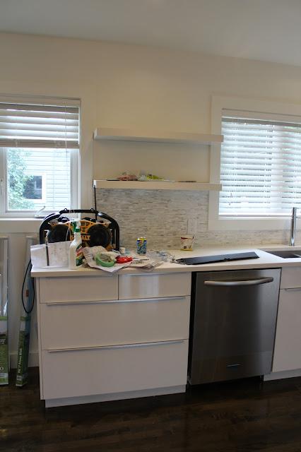
Before...
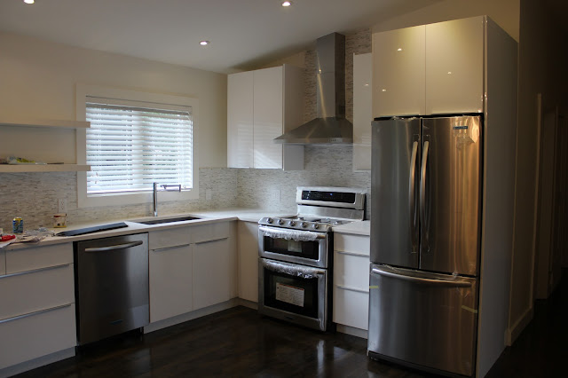
After...
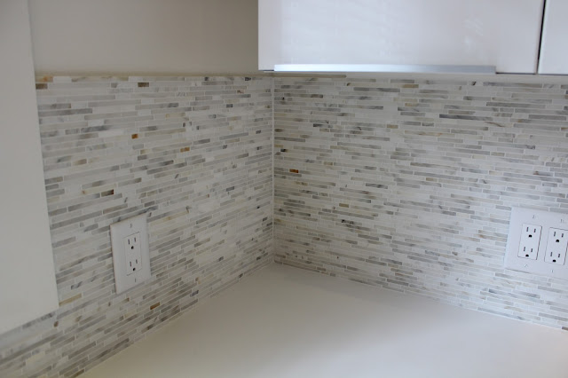
Here's a close up of the calacatta marble bullets. I was honestly surprised at how busy the tile was and also how many coppery tones there were in it. The small sample we had was more subtle looking. I understand with marble it all depends on the cut of the stone. I still think it looks amazing and achieved the look I was going for.
I decided not to add a cabinet in between the windows like the old kitchen had. I think it makes it feel more open and spacious this way and allows more light to come in. Having a few open shelves in a kitchen allows for some serious styling anyway.
Some filler pieces and trim still need to go on and of course some cleaning and unwrapping of that beautiful KitchenAid double oven gas range that I really wished accidentally ended up at my house. Apparently the delivery driver didn't feel the five bucks that I slipped him was enough to make the detour and risk his job over. Check back later this week for more photos as well as a list of sources. Enjoy your great week!!


I love your kitchen designs! You have fantastic taste :)
ReplyDeleteThank you very much! You are so kind:)
DeleteHi Jacqueline,
ReplyDeleteFew questions, your kitchen looks awesome!
1) Did you hire anyone to help you do this renovation?
2) Do you have undercounter lighting and if so is it LED?
3) Did you do the Ikea layout design yourself from their website or ask someone to help you? It appears you did not need any filler pieces?
4) Did you go with the ikea akurum plastic legs and if so which plinths did you use, as they do not offer white gloss abstrakt plinths.
5) Do you have a pantry? I am having such trouble because the ikea pantry is 88" high, and with the 4" akurum legs the pantry would be 92" tall, whereas my fridge is 70" tall and the ikea cabinet for over the fridge is 24" tall for a total of 94", so it would not match up with the 92" tall pantry. Any advice?
Hi Michael,
Delete1.) The homeowner hired myself to do the design and he hired my husband to install the cabinets. He then hired other different companies to install the quartz counters, tile, etc.
2.) I usually install undermount lighting in every kitchen but we didn't do it this time. This kitchen had really good light sources already and since there were such few upper cabinets we decided to forego the undermount lighting. I also wanted to install the trim along the bottom of the cabinet using the thin side of the trim for a more modern look rather than the bigger side, which would have required more customization than usual to conceal the under mount lighting wires, etc. Although looking back now I wish we had of put in the extra work to do it since I think undermount lighting adds considerably to the design and functionality of any kitchen.
3. I did the layout of the kitchen myself using their website kitchen planning tool. When we were ready to order it they helped me figure out how many filler pieces I would need. I only needed some filler pieces for the corner on the base cabinets where the two angles meet and also the end piece on the upper cabinet where you can see that the cabinet doesn't quite meet the wall in the picture above. In the finished photos, which I will post soon, you will be able to see that the cabinets look like they go all the way to the wall. I also needed a filler piece in between the cabinet above the fridge and the big panels (gables) on the sides in order to leave enough room for the fridge to fit. Our fridge was 30" wide and so was the cabinet that sat above it. I chose that size because the only other option was 36" wide which would have been too wide (wasting a lot of space) and we were very limited in space already. So we added a smaller panel the same height as the upper cabinet in between the cabinet and big panel to add some space. With stock cabinetry it's all about creativity (and a good carpenter) to sometimes make things work.
4.) Yes we used the plastic legs. We used the Perfekt Plinth in foil white (700.385.04).
5.) Yes we used the 88" high pantries. They are on a different wall and I don't have pictures on here yet. They were also stand alone cabinets so we didn't have any issues with the height. For your situation you can just add a piece of trim or filler piece along the top. Whenever you do trim across the top you want to try and run it the full length of the cabinets and any gaps in between would get filler pieces to make it all flush. In your situation though it will depend on whether your fridge cabinet goes all the way to the ceiling then you may only be able to put the trim or filler piece above the pantry and whatever other cabinets you have along that wall, which would be fine.
Another thing I always do and will suggest is to try and make the cabinet above the fridge flush with the depth of your fridge. Those cabinets are never as deep as the fridge is so we usually add some 2x4s, or whatever thickness we need, to the wall first and then attach the back of our cabinet to that. Then you will need the big gables (panels) to cover the sides, which are 96" tall by 36" deep so you can cut them down to size. It's a bit of work but it's a much nicer custom look if you can make it the same depth as your fridge and that way the fridge doesn't look like it's sticking out. I guess that will all depend on whether you have the wall space to add a few inches for the extra panels.
Hope this helps. Good Luck. I'd love to hear how your kitchen turns out.
One other thing? I see your outlets are not GFI outlets which I believe are required by code, was there a reason for this or am I wrong? Thank you.
ReplyDeleteBEAUTIFUL KITCHEN!
Hi Michael, You are correct in that the code is to have GFI plugs. The owner was having them upgraded after these photos were taken. Thanks.
DeleteThanks Jacqueline for your thoughts!! I went to Ikea today and I was there for like 4 hours working with the kitchen it was crazy.
ReplyDelete1) I love the backsplash, just would like it without the copper specks, would you mind letting me know where you got it from? Also did you buy the quartz from ikea and if so which one?
2) I'm getting the 2" decorative strip on the top and on the bottom of the cabinet so I can add some LED lighting.
3) In regards to the pantry I'm going to have to build up a 1-2" base underneath it and just add an extra piece of cut plinth so that the pantry lines up with the rest of the upper cabinets.
Do you have any suggestions or recommendations for the following layout I made?
http://kitchenplanner.ikea.com/US/UI/Pages/VPUI.htm?LoadDesign=18e76e72a31441f9a6efd35fa631a660&UIContext=Kitchen&IsSharedDesign=1
Note that the pantry/microwave next to the fridge is going to be slightly modified, the door will be a 24" door like the ones above the fridge, and a base will be built so that the seam will be in line with the top of the fridge line, and I will then add a filler piece below the upper pantry door to put the built in microwave.
Hi Michael,
DeleteThe backsplash tile is from Saltillo Tile. It's calacatta marble which can have browns/golds in it so if you don't like the copper specks then Carrera marble or Oriental White Marble or another type would be better. In my post about the Ramsjo kitchen that we did you can see carrera strips on the blackspash. No we did not use the ikea quartz. I'm not certain off hand right now what the name of it is but will try to find out.
With regards to the your kitchen design...One thing I like to have beside the stove is a set a drawers. I know you have top drawers on each side which is great for utensils and large cooking utensils but I like having drawers for pots and pans rather than cupboards. I do like the symmetry you have right now with the current cabinets being the same on each side of the stove and you can probably only change it to drawers on one side because you may have difficulty opening drawers on the left side, which would be fine too. I know you have other drawers on another wall as well and look like they are fairly close to the stove. Having them beside a stove is just something I like to do but I think your plan works just fine.
I also notice you have a pull-out base cabinet against a wall with a doorway/entrance right in front of it (beside your sink cabinet). I would make sure that you will be able to pull out that drawer as far as you need to and that the casing (around the door frame) isn't in the way. I learned that the hard way in a bathroom recently when we installed the Godmorgan vanity with drawers and had to change the casing because we couldn't open the drawers all the way. You only have one inch in between the cabinet and the wall right now. You could move it over another inch if you change the drawers at the far end of that wall to one long set of 36 inch drawers and slide them down an inch or two. I understand you were probably designing it based on having your sink faucet centered perfectly with the window. If you move it down an inch or 1.5" it would still be okay visually with the window and sink. Another option, if you do need to move the whole thing down an inch but want to keep your faucet centered, is to keep your actual sink where it is but just move the cabinets since you have a 36" sink cabinet you may have enough room to do that (but physically check the size of your sink first including the under mount part to make sure it will fit. You will also need to talk it over with the quartz installer to make sure they know the sink will be centered with the window and not the cabinet and they will usually let you know if that will work or not but since they don't usually come to template it until after your cabinets are installed you will need to check it yourself first if that's what you choose to do). Having your sink off-centered by an inch in the window is fine too especially since you will probably have a fancy faucet to distract from it:).
One last thing...I'm not sure if you have a single door fridge or double door but if it's a single door, make sure it opens the correct way. In your case you would want the door handle on the right side so that when you open it the open part of the fridge is facing into the kitchen and you are able to easily pull out food and place it on the counter next to the fridge, rather than opening the opposite way where you would be walking around the fridge door to access the fridge and/or counter. Make sense?! Most fridge doors are reversible so it should be easy to switch over if you already have a fridge and need to change it.
We'd love to see your finished kitchen! Good luck!
Hi Jackie, I am remodeling my kitchen with somewhat similar layout as yours. Yours looks fantastic!!! Could you tell me the measurement/distance from the outer side of the fridge to the wall with the window?
ReplyDeletethank you,
Ruth
Hi Ruth, I don't remember the exact measurements as that house was renovated and sold last year but I believe it's about 115-117 inches. Thanks, Jackie
Delete