budget bathroom makeover

Hello!  Thought I would share a few photos of a budget bathroom makeover that I did.  The house was being sold so unfortunately I couldn't inject my alter-ego Kelly Wearstler design style into it.  I know my design projects aren't exactly swanky yet but I like to share my experiences with trying to create a semi-decent design with limited funds (aka: the budget for the house was already blown at this point), limited sources (aka: in-stock hardware store options only), and limited Hollywood glam (aka: NO Kelly Wearstler inspired ideas).  I like to share stories from my stress-filled fun filled days of pretending to be a designer because I know how much said stories from others have helped me. 


Before:


After:


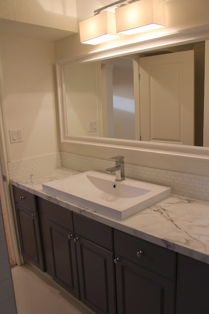
This bathroom was in a basement and had a really awkward layout making it long and skinny.  Since it wasn't in the budget to change any of that I had to work with trying to brighten it up and make it look a little less awkward.  We opted for basic white subway tile around the tub and an inexpensive white tile for the floor.  Yes, the floor tile is white.  I know it looks very warm in these photos but it was white.  And yes I am registered to take a photoshop class very soon.  We kept the vanity and painted it BM Whale Grey and added some new knobs from Ikea.  The counter top is Belanger laminate Calacatta Marble and was purchased from Rona (Canada).  I saw this same counter used on Income Property and thought it looked great paired with some higher end finishes (it's all about the high/low with budget decorating isn't it).  There is a really good pinterest board with all the episodes where they used these laminates where I found inspiration  http://www.pinterest.com/formicagroup/formica-laminate-on-hgtvs-income-property/  This counter was actually a kitchen counter but we cut the back off to fit the vanity.  Cutting the back off of these ready-made counters is something I always do anyway even in kitchens.  I don't like the little back splash pieces of formica that come attached to the counters so we cut them off and tile all the way down to the top of the counter.

Benjamin moore whale gray grey marble budget bath milk glass tile

The sink is probably my favourite item.  I love the clean, modern lines around the edges and how low it sits on the counter.  So many of these in-stock, top-mount bathroom sinks sit a lot taller on the counters and usually have rounded edges or a round look to them so I was really happy to find this more modern one at Rona (love their Uber Haus product line).  I only wish it had a 3 hole faucet option as I think it would have looked better with a different faucet.  The backsplash tile is milk glass from Saltillo tile.  Okay, okay, I know milk glass isn't exactly budget friendly but I liked it the best and it is all about the high/low right...right?  I'm sure white subway tile would have been fine too...maybe.  The white framed mirror is from Rona but I know Ikea also carries a very similar mirror.  A big mirror was definitely a necessity to help enlarge the space.  

Benjamin moore whale gray grey marble budget bath milk glass tile

Now...about the wall colour and light fixture...the walls were painted BM white whisp but for some reason this bathroom was painted a second time by a painter who mixed the remaining small amount of white whisp with some cloud white and this was the end result.  I'm not sure why this happened but unfortunately it did.  The straight-up white whisp looked so much nicer and was perfect with the whale grey!  The light fixture was also kind of a mistake.  It was originally purchased for somewhere else but when it didn't work out and we could no longer return it, it ended up here.  I do like the light very much and think it looks okay in this space but it's not the best choice for a bathroom when it's the only light, as it does not give off a lot of light, and wouldn't have been my first choice for a small, dark basement bathroom.  Oh well.  I think all in all it still turned out okay for a budget bathroom in a house that was being put up for sale.  Unfortunately I also didn't get to do any styling for these last minute photos (yes I took them 10 minutes before the new owners took possession) but if you can imagine this with a big, beautiful orchid on the vanity and a pretty shower curtain you will hopefully see the vision.  My crazy fixation on painting something grey while adding something marbley looking to it has finally been met.  Time to move on to my next crazy fixation...pink and brass in my home office!!!  And there will probably be something marbley added in there too.  Hello alter-ego.  It's so nice to see you again!!!   

Benjamin moore whale gray grey marble budget bath milk glass tile

ikea abstrakt (white high gloss) kitchen in progress

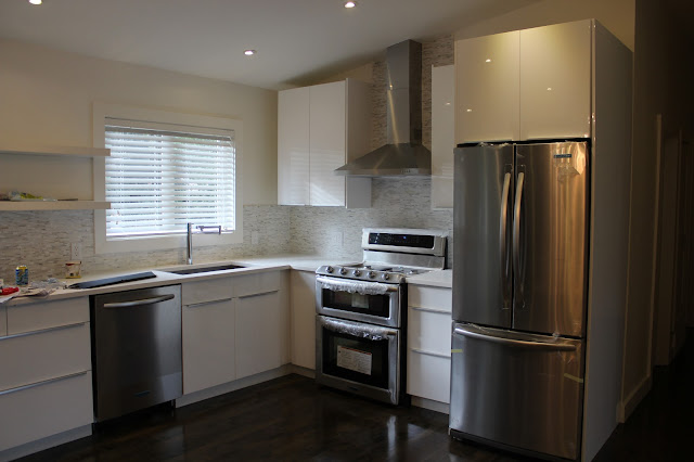
We are not quite finished our latest kitchen project but I thought I would share some photos since it's close to done and you can see how things are coming together.  This time we used the Ikea Abstrakt white high gloss kitchen cabinets with white quartz counters and calacatta marble bullets for the backsplash.  I'll post the sources later this week when we are completely finished.  Here's a few before and after kitchen photos.

Before...


After...

ikea abstrakt white high gloss kitchen calacatta marble


ikea white high gloss kitchen abstrakt
One thing I love in this kitchen is the faucet.  I think it's got that ultra modern look that just goes so perfectly in this space. I purchased it from Rona (in Canada).  It's the Uberhaus brand.
ikea white high gloss kitchen abstrakt

ikea white high gloss kitchen abstrakt calacatta marble
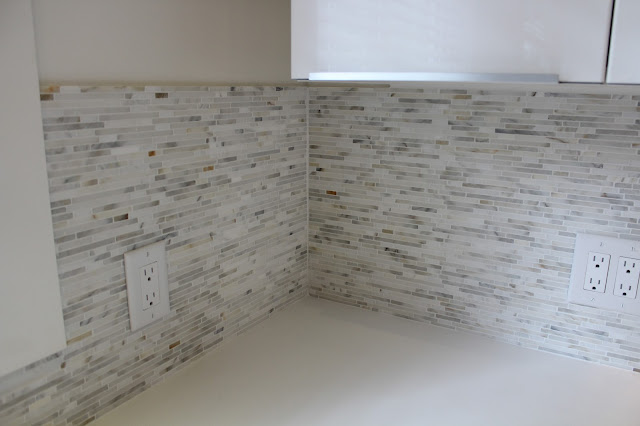
 Here's a close up of the calacatta marble bullets.  I was honestly surprised at how busy the tile was and also how many coppery tones there were in it.  The small sample we had was more subtle looking.  I understand with marble it all depends on the cut of the stone.  I still think it looks amazing and achieved the look I was going for.  
ikea high gloss kitchen calacatta marble
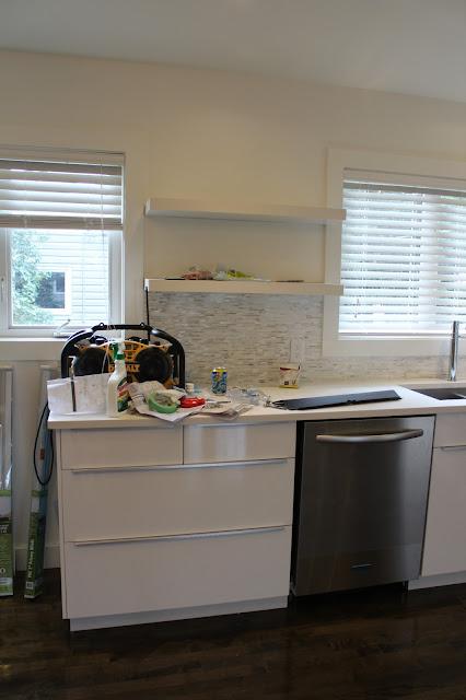
 I decided not to add a cabinet in between the windows like the old kitchen had.  I think it makes it feel more open and spacious this way and allows more light to come in.  Having a few open shelves in a kitchen allows for some serious styling anyway.

ikea white high gloss kitchen abstrakt

Some filler pieces and trim still need to go on and of course some cleaning and unwrapping of that beautiful KitchenAid double oven gas range that I really wished accidentally ended up at my house.  Apparently the delivery driver didn't feel the five bucks that I slipped him was enough to make the detour and risk his job over.  Check back later this week for more photos as well as a list of sources.  Enjoy your great week!!


ikea adel kitchen

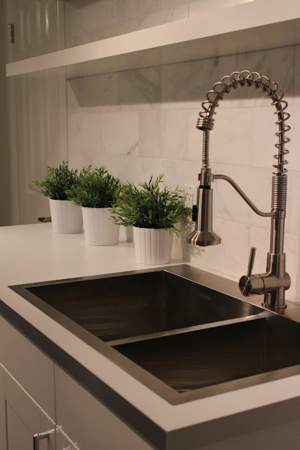
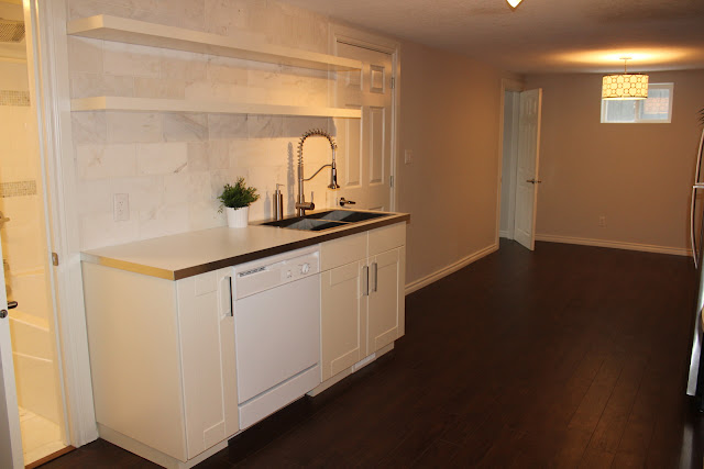
Here is the Ikea adel kitchen we did for a small basement suite with an even smaller budget.  It was hard to get good photos with such poor lighting (gotta love basements and their teeny windows).  The cabinets are Adel.  The counters are Numerar double sided white/grey with metal effect edge.  The backsplash was a marble tile I found on kijiji.  The faucet and hood fan were from Costco.  The shelves are from Ikea.  Wall colour is BM Pale Oak.  


ikea adel kitchen numerar
ikea adel kitchen numerar counterikea adel kitchen numerar counter

till we meet again

I never planned on having this blog become too personal but today I decided I wanted to let the world know about a beautiful soul who came into my life 18 years ago in the form of a green-eyed, tortoiseshell kitty name Basil and who, sadly, had to leave my life recently.  It seems like only yesterday that she came stumbling out of a box of kittens, as she fought to keep up with her brothers and sisters all vying for the attention of onlookers out to adopt a new kitty.  She was the smallest of the litter and from the first moment I saw her teeny-tiny body with her teeny-tiny stripes my heart swelled and I smiled knowing she was the one.


Every day for 18 years she has greeted me at the door every time I came home and every day for 18 years was there to say goodbye.  She helped me through so many life changes, from my early years of university, to broken hearts over boyfriends, to pursuing new dreams while letting go of some old ones, she was always there with her unconditional love and sand-paper tongue kisses (gotta love 'em!).  She always reminded me of what was important in life especially when I realized that I was her world and the reason she had so much love to give.  From the crazy, rambunctious kitten who always made us laugh to the wise old soul who decided the ugliest chair in the house was going to be her favourite, she has brought so much joy to our lives.


Once again my heart is swollen but this time from sadness and pain.  I've heard that knowing it's coming makes it a bit easier but it doesn't.  During her last few days I kept telling her it was okay to go but she was so brave and strong and held on until she knew I was truly ready.  Her last 24 hours we never left her side and I shared some of my most special moments with her during that time.  As I laid with her in her last hour at home she reached out her paw and laid it in my hand for the full hour, never moving it except to tighten her claws ever so slightly every time I spoke to her, or when she just needed to make sure I was still there with my hand out for her to hold as we said our goodbyes.  


For 18 years I have fed her, cared for her, made sure she was comfortable and happy and it kills me inside that I can no longer do that for her.  I don't know when my habits of wanting to check in on her or to say goodbye as I leave the house will start to fade, or if I ever really want them to, but I know for sure that my memories never will.  I have been so blessed by this beautiful soul who came into my life for so many reasons and as I find the strength to move on I know that she is at peace, as the sun shone warm and bright on a day that was supposed to be snowy and cold.  For years I complained about the ugly, old chair but never had the heart to get rid of it.  That chair still sits in my office where it's always been and probably will for a while.

good night sweet girl!

a new look for an old space - ikea ramsjo kitchen

Finally I have a moment to take a breather and post some finished photos of the house my client renovated. We literally just finished the house yesterday and it was listed for sale today and sold within a couple hours.  

Here's a look back at the kitchen before:


And the kitchen now:

ikea ramsjo kitchen

 
ikea ramsjo kitchen

 
ikea ramsjo kitchen

ikea ramsjo kitchen

ikea ramsjo kitchen


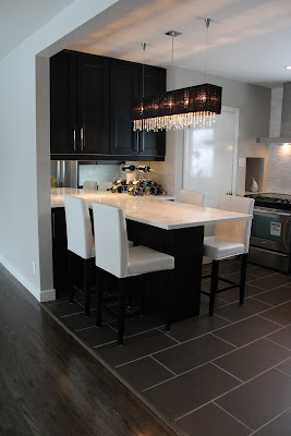
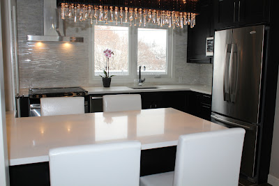
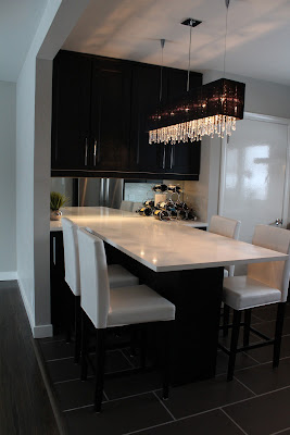
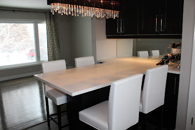
Here's a few other photos of our built in table.  This area at first was going to have a banquette eating area with the banquette seat in the alcove with some cabinetry below the seat and some small cabinets above but since this kitchen is only 100 square feet, and needed to include a door leading to the basement, it was impossible to create a functional kitchen with enough cabinet space.  So we opted to go with a built in table which allowed us to increase our cabinet space by quite a bit by adding cabinets under the table and  larger wall cabinets as well.  It also substantially increased the counter top space, which we made the same height as the kitchen cabinets at 36".  As you can see we also took out the wall separating the kitchen and living room. 


ikea ramsjo black brown kitchen

ikea ramsjo black brown kitchen


ikea ramsjo black brown kitchen

I also added a mirror back splash instead of tile to help visually enlarge the space.  I originally thought about doing glass doors on the cabinets above this table but since the house is so small I wanted to try and keep the visual clutter to a minimum and thought this offered a cleaner look for this space.  The light fixture was the homeowners choice and was well priced at $150.  I do like the light but it wasn't my first choice for this space.  My concern was that there were already too many linear lines going on between the table, the back splash, the hood fan, the handles, the floor tile, etc. that I felt a different shape needed to be introduced.  I do like it though and think overall it turned out well.  I'm still learning how to work with clients.  Lesson learned:  remember to take my spine with me on the next shopping trip.

Kitchen cabinets - Ikea Ramsjo Black Brown
Wall colour - Benjamin Moore Revere Pewter
Counters - White Quartz - Snow White
Chairs - Jysk
Light - Cartwright Lighting
Backsplash Tile - Lowes - I believe it's called split face and it's carrara marble

Hope you enjoyed the photos and be sure to check back as I post photos of the rest of the house including the basement suite with another pretty ikea kitchen.  Also be sure to check back as I reveal the secret to getting stains and scuff marks out of white quartz.  You'll never guess how we did it!!  Bye for now.

jackie